Search
Data of the month | Multidimensional poverty and monetary poverty: are the results similar?


Did you know that there could be large disparities in the number of poor people depending on the way in which poverty is measured? Comparing the levels and changes in income poverty and multidimensional poverty reveals a complex history, and reinforces the need to complement traditional monetary measures with a multidimensional approach.
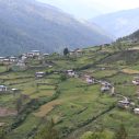
Let’s use the example of Africa to illustrate this situation: a region that has eight of the ten countries in the world with the greatest differences between people who are multidimensionally poor (using the Global MPI) and income poor, according to the USD 1.90 measure per day. As can be seen in the graph, there are important variations between income poverty (the black dots), and multidimensional poverty (bars). The latter shows, in addition, two levels: “multidimensional poverty” (the entire bar) and the “destitute” (the darkest portion of the bar) – the group of people in multidimensional poverty but identified using even more extreme criteria, somewhat analogous to “poverty” and “extreme poverty” by income.
Countries such as Ethiopia show significantly higher levels of multidimensional poverty (and even destitution) than income poverty. In contrast, countries like Lesotho illustrate the opposite effect, with higher levels of income poverty. In some cases, there are also countries where poverty levels are similar regardless what measure is used.
Overall, Africa has a smaller number of income poor people than multidimensional poor (388 million versus 544 million, respectively). This is because multidimensional poverty measures reveal aspects of poverty that can go unnoticed if we only consider income.
Source: http://www.ophi.org.uk/wp-content/uploads/Global-MPI-2016-8-pager.pdf